> ## Documentation Index
> Fetch the complete documentation index at: https://arize-ax.mintlify.site/docs/llms.txt
> Use this file to discover all available pages before exploring further.
# Dashboard Widgets
> Customize dashboards with widgets
export const AskAlyx = ({children}) => {
const gradientId = `askAlyxGradient-${Math.random().toString(36).slice(2)}`;
return ;
};
# Widget **Overview**
Dashboard widgets are the individual tiles that help create a dashboard view. Widgets provide an easy way to customize dashboards and perform ad hoc analysis. They can be used to build dashboards from scratch, or as a way to modify [templated dashboards.](./#token-tracking-and-latency-template)
# **Widget Types**
## **Experiments**
Tracking experiments over time in your dashboard lets you visualize the progress and results of specific evaluations and see how different experiment versions compare.

1. **Start a Dashboard**\
Begin with an existing dashboard, a blank one, or use a created template.
2. **Enter Edit Mode**\
Switch to edit mode to enable adding and configuring widgets.
3. **Add the Experiments Widget**\
Select or drag the 'Experiments' widget into the dashboard to start configuring your experiment tracking.
4. **Select a Dataset**\
Choose the dataset associated with your experiments that you want to visualize.
5. **Choose Evaluations to Track**\
Specify the particular evaluation metrics you want to monitor over time. This can include key metrics you’re using to measure experiment success.
6. **Interactive Experiment Details**\
To view more details for any experiment in the widget, hover over the desired experiment and click to access in-depth insights about that experiment’s metrics, configurations, and results.
## **Time Series**
Use time series widgets to view metrics over time, helping you track trends and monitor performance. Common metrics to visualize in a time series include token count, number of sessions, errors, and costs, among others.
**Ask Alyx** to add the time series widget for you -- try *"Track p95 latency for LLM spans over the last 7 days."*
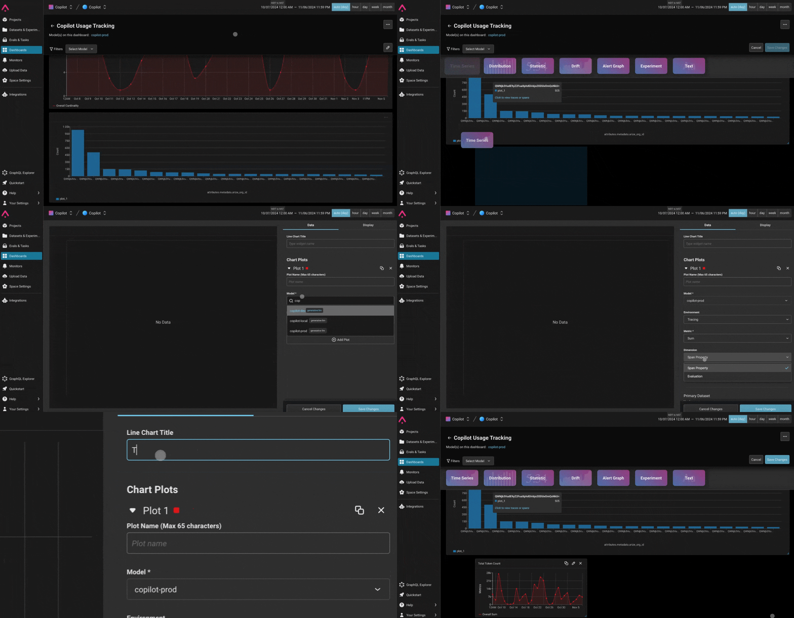
1. **Start a Dashboard**\
Begin with an existing dashboard, create a new blank dashboard, or use a pre-built template.
2. **Enter Edit Mode**\
Switch to edit mode to add widgets and configure their settings.
3. **Add the Time Series Widget**\
Select or drag the 'Time Series' widget into your dashboard.
4. **Define the Plot**\
Choose the metric you want to track. For example, you could monitor `attributes.llm.token_count.total` to track costs, or select a custom metric you’ve defined.\
Time series plots are ideal for visualizing data trends over time, making it easy to spot patterns or changes in metrics.
**Track Evaluations**\
You can also use time series widgets to track evaluation metrics. For example, you might track label counts over time or create custom evaluation metrics to gain insights into model performance as it evolves.
## **Distribution**
A distribution widget helps analyze the spread and concentration of data within your dashboard, useful for understanding the distribution of dimensions or evaluations.
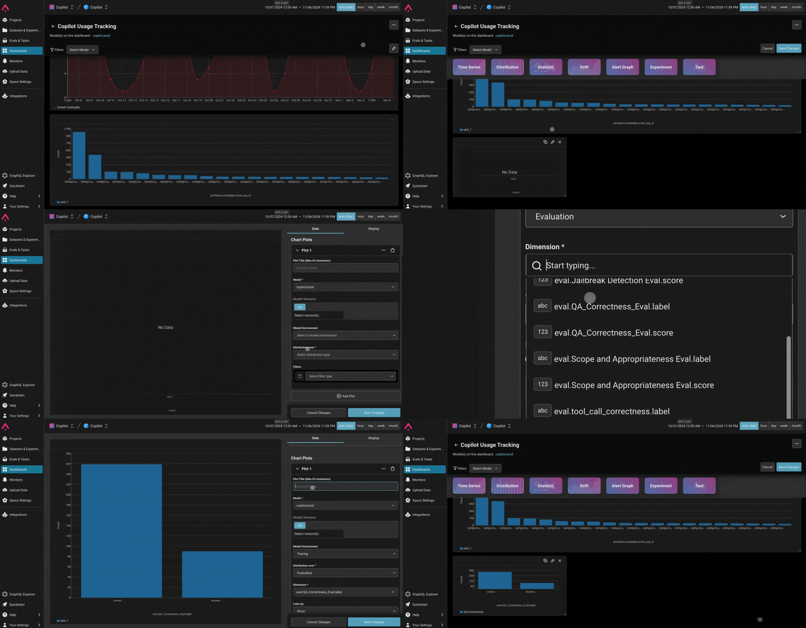
1. **Begin with a Dashboard**\
Start with an existing dashboard, a new blank one, or a created template.
2. **Enter Edit Mode**\
Enter edit mode to start creating and configuring widgets.
3. **Add the Distribution Widget**\
Select or drag the 'Distribution' widget creation button into your dashboard.
4. **Define the Plot**\
Choose the model you want to analyze and select the distribution type, such as span property or evaluation. Then, select the specific dimension to visualize.
5. **Adjust Display Options**
* For **numeric dimensions**, you can customize the view by choosing a binning strategy (e.g., equal-width bins or custom intervals).
* For **categorical dimensions**, slices will automatically display for each unique value, making it easy to see the proportion of each category.
If you select a feature with a string data type, values will be bucketed by the unique values rather than numeric ranges. This flexibility allows you to analyze both numerical and categorical data effectively.
## **Statistic**
Highlight essential performance metrics in a snapshot view, perfect for monitoring key metrics across environments.
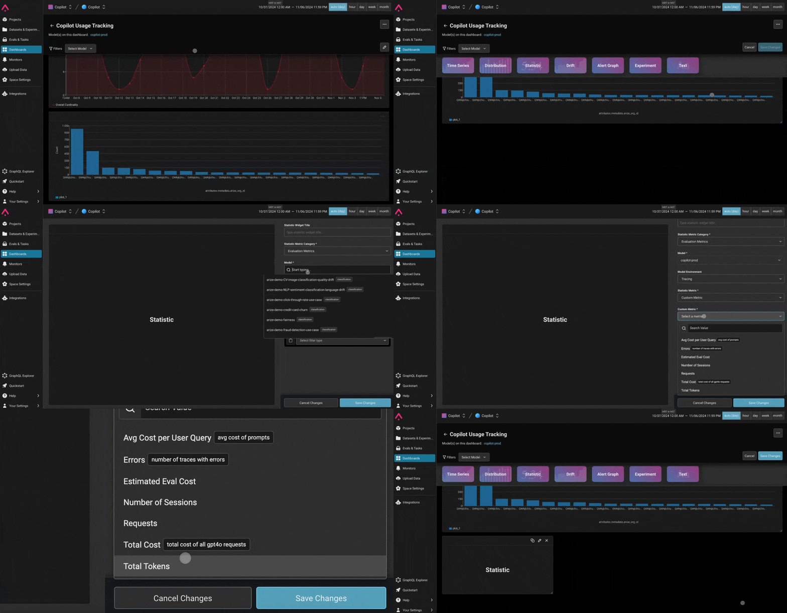
1. **Start with a Dashboard**\
Use an existing dashboard, create a blank one, or start with a created template.
2. **Enter Edit Mode**\
Switch to edit mode to add and configure widgets.
3. **Add the Statistic Widget**\
Select or drag the 'Statistic' widget square into the dashboard.
4. **Define the Metric**\
Specify the evaluation or performance metric to display. Define the rest of the widget by choosing the model, metric, model environment (e.g., Production, Pre-production), and version (if applicable).
5. **Add Filters for Specific Insights**\
Narrow down the metric by adding filters based on features, actuals, predictions, or other dataset attributes to ensure you're viewing the most relevant data.
## **Text**
Use the text widget to add annotations or metadata directly to your dashboard, providing context and enhancing readability.
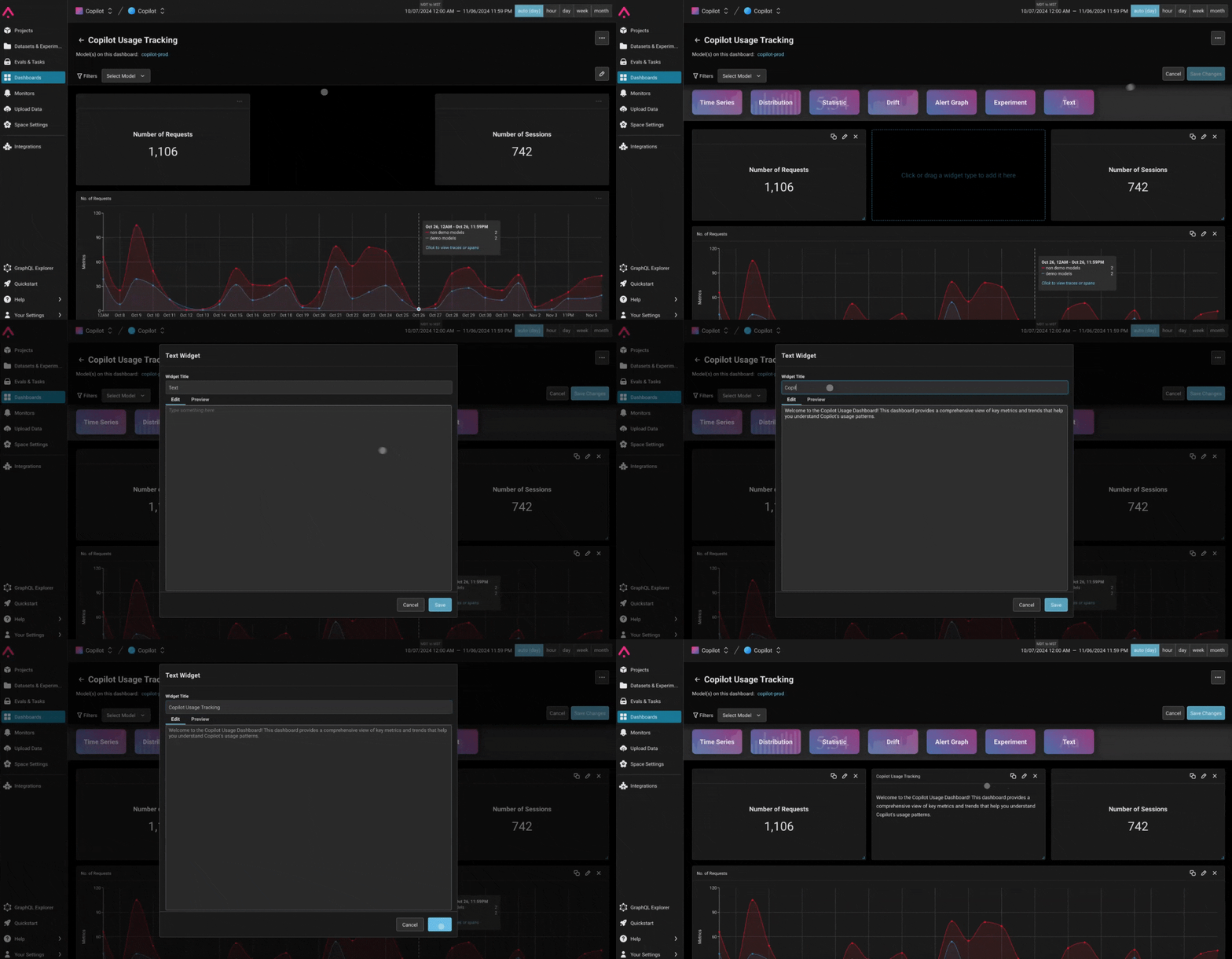
1. **Start a Dashboard**\
Choose an existing dashboard, a blank one, or a pre-made template.
2. **Enter Edit Mode**\
Go to edit mode to configure widgets and add information.
3. **Add the Text Widget**\
Select or drag the 'Text' widget square into the dashboard.
4. **Type Annotations**\
Add notes, explanations, and any other relevant information that helps provide context or interpret the data within the dashboard.
## **Scatter Plot**
Use the scatter plot widget to visualize how different attributes are correlated in your project.
1. **Start a Dashboard**\
Use an existing dashboard, a blank one, or start with a template.
2. **Add the Scatter Plot Widget**\
Add the Scatter Plot widget to the dashboard using the “Add widget” button in the top right.
3. **Define the Plot**\
Choose the project you want to analyze, and then select dimensions for the x and y axis, such as span properties.
## **Pivot Table**
Use a pivot table widget to compare and analyze attributes across a category in a project.
1. **Start a Dashboard**\
Use an existing dashboard, a blank one, or start with a template.
2. **Add the Pivot Table Widget**\
Add the Pivot Table widget to the dashboard using the “Add widget” button in the top right.
3. **Define the Plot**\
Choose the project you want to analyze and select a dimension for the row which will group the data by a category. Then, select what to display in the columns using the values fields. For example, see how token usage varies across models in the project by using model name as the row, and adding token count as the value.
Enjoy building insightful, tailored dashboards with these widget options to meet your analysis and monitoring needs!